

27/11/2017
NEWS STORY
 Having endured one of the most tedious 'races' in living memory, a few half-hearted donuts and a podium ceremony that resembled a wake, F1 chose to subject fans to yet further misery.
For as the 2017 season came to a close, fans were offered a glimpse of the sport's future… and it wasn't nice.
Sadly, it was not the decision to scrap the Halo's introduction next season, the possibility of returning to V8s, V10s or even V12s from 2021, it wasn't even the decision to scrap the dreaded engine penalties or re-write the aero rules in order that farces like Sunday cannot happen again.
No, instead, it would appear that according to Liberty Media, the panacea for the sport's numerous ills is a new logo.
While Sky Sports F1 managed to find half a dozen positive tweets regarding the new logo, the rest of the world was left seriously underwhelmed.
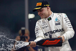
Indeed, perhaps the mood was best summed up by the three drivers that had just returned from the podium.
Asked what he thought of it, Valtteri Bottas, who like countryman Kimi Raikkonen, is not known for outbursts of enthusiasm, said: "I kind of like the old one. I only saw it very quickly.
"Just say you don't like the new one!" said Sebastian Vettel
"What's wrong with the old one?" asked Bottas. "I don't know. I think it's quite cool."
"I liked the old one better," insisted Vettel.
"The problem with logos," began Lewis Hamilton, "I think the one that we already had was an iconic logo I think.
"Just imagine Ferrari changing their logo, or Mercedes changed their logo. I don't think the new one is as iconic but maybe it will grow on us."
Judging by the general reaction on social media that doesn't appear likely, certainly in the short term.
While Chase Carey insists the change of logo is to "inject fresh energy and innovation" into F1, the new logo is actually retro in style.
Formula One's director of marketing Ellie Norman, told Reuters: "I think over time it will be received positively. Having shared it with the teams on Thursday and with our sponsors and partners on Wednesday, the feedback has been incredibly positive."
However, as Creative Review confirms, the logo change isn't so much about energy and innovation, but the sport's determination to build on the F1 brand and branch out into serious merchandising, something F1 failed to do so on Bernie Ecclestone's watch.
Indeed, merchandising under Bernie was more about upmarket goods, such as money clips and wallets, while under its new ownership the sport is clearly targeting the fan on the street with T-Shirts, caps and the like.
Indeed, the new look isn't limited to the logo, with TV graphics and pretty much everything else, including the numerous access passes, to get an overhaul in time for 2018.
Charged with coming up with the logo, indeed the whole new look for F1, was Richard Turley at Wieden+Kennedy London, overseen by Ellie Norman.
"The impetus has been to really make it more fan-focused, to understand that that is the heart and soul and future of the sport," Turley told Creative Review.
The project followed an "in-depth research campaign" (no us neither), which resulted in the powers that be feeling that fans saw the technical side of the sport as having taken over from the human side of it.
"Seeing that research and how people talked and thought about the sport enabled us to write a brief for ourselves in terms of the design and media around it," says Turley. "The strategy all came out of that intensive fan-focused activity. That was the starting point, then we could write a brief in and around what the identity needed to do."
"Fans want to heighten their association with Formula 1 through the drivers, competition, the human side of the sport and the feeling of being on the edge when watching wheel-to-wheel racing," adds Norman. "This moves us away from the perception of F1 being inaccessible and just about the cars and business."
The new logo, which replaces that designed by the Carter Wong studio in 1994, was chosen from hundreds of concepts, and one can only guess the cost - though the teams will no doubt get to learn it when it is deducted from their prize pot.
Interestingly, Turley's Twitter page boasts the phrase "drunk till I die", which kind of ties in with the feeling that the new logo began life on the back of a beermat. Perhaps it should have stayed there.
Incidentally, under the old ownership, a vast army of lawyers was employed to ensure that the F1 logo wasn't used without permission - including in the media - let's hope under Liberty Media the sport is a little less litigious and that the various media outlets revealing the new logo today aren't about to be hit with the customary "remove it or else" threat.